Principles of e-Learning Design
“Life is a travelling to the edge of knowledge, then a leap taken.”
-D.H. Lawrence
Online teaching and elearning design are fascinating niches for those who like to teach on the edge. We learn to be both courageous and vulnerable when we see teaching in shades of challenge and experimentation. While many professionals who first go online may search for the holy grail of content delivery for seamless productivity, the truth is that the best content comes from teacher-student interactivity. This is not to say that we publish separately for every single student we meet, but it does mean that content must be creative enough to allow students to shape the learning process.
This article will focus on the look and feel of elearning design from humanistic perspectives. The innovative online teacher can become productive by dropping the content delivery and seamless productivity policies of international publishing giants.
What is humanism and why is it important?
Classical humanism dates back to The Renaissance during the middle ages when the revival of the humanities and literary culture placed new emphasis on the human learning experience above and beyond systems and dogma.
In terms of today’s language teaching we also have a fine humanistic tradition initiated by authors such as Mario Rinvolucri, the Humanising Language Teaching Magazine, and, more recently, the C Group website and Facebook group and collaborative creativity projects such as the recently published ELT book called Creativity in the English Language Classroom.
Human potential, creativity and learner autonomy define true learning experiences, lessons, courses and education. Anything less is an information- based package deal.
We tend to associate eLearning and educational technology merely with geekdom, tools and apps, whilst failing to see that, in the words of my poetic colleague Rakesh Bhanot:
“Sometimes you have to
be extremely old-fashioned to
be innovative”.
A lot of online teacher training focuses on the nuts and bolts of technology and product delivery. A lot of my own teacher training webinars and blogs also focus on the nuts and bolts. This is all good and necessary. But it’s not everything and it’s not enough. The only reason I use technology in the first place is for greater connectivity, creativity and social learning impact.
Your content must reflect the soul of your work. This soul must reach the soul of your learner. Those who say that technology is killing the teaching spirit are so wrong. Technology has soul because as humanistic teachers we wield our tools to enhance creativity, growth and success. Technology can blast the teaching spirit into increasingly intelligent terrains. I see this all around my teaching networks and celebrate the fact every day of my teaching and blogging life.
To be truly innovative and effective we’ve got to learn from pre-cyber eras and timeless truths. It’s time started thinking in terms of humanistic-driven educational technology. The connection between humanism and technology has yet to be fully appreciated. Many of our most creative published writers tend to be of pre-cyber fame, whilst the rest of us are still figuring out how to use technology wisely.
In light of the above, my advice for plotting the essence of your teaching vision onto your course content is to be timeless, be old-fashioned and then…only then, can you be truly innovative.
Content delivery & seamless productivity?
What does that sound like to your ears? Isn’t it reminiscent of assembly lines and corporations? As online teachers or elearning designers we do not deliver, we unveil. We can afford to be artists because we are passionate about the hearts and minds of our students as well as the unfolding nature of creativity as a learning prerequisite.
Content delivery usually means that you publish information and deliver information. This information is of the one-size-fits-all variety. This information is just information. The people who condemn technology for taking over the role of teachers are missing a vital point. The information age gives free access to knowledge, per se, as in facts. That’s all it does. Teachers do much more than that. Teacher attitude determines how useful or useless technology and content can be.
As Shakespeare once said…
“Nothing is either good or bad but thinking makes it so.”
Are you going to provide more information overload for your students or are you going to provide superior learning experiences?
Massive publishing giants can afford to package and sell information in the name of business and profit. Freelance online teachers cannot compete with this and nor should they. If publishing giants are cheap chain stores, we are boutiques.
It may feel good to package up some information; signed, sealed and delivered. A lot of typical self-paced courses do this. But this is a learning illusion. It’s a bit like a magic bean that can’t turn into a beanstalk because there is no soil. Create content that students can interact with, learn
from and grow from and then you’ll have a large beanstalk full of insights and learning branches – a mindmap of wired neurons – messy, creative and chaotically inspiring.
The principles of elearning design.
The art of self-expression and engagement is as old as time itself. Think stories, creative zones and inspiration. When we embed our own principles and values into the teaching process, then our content become streamlined, flexible and fun to create. If we dare to move beyond the flatscapes of print into multimedia, we need to reconsider what content creation means in terms of preparation and design.
Preparation
It’s not about you, your professionalism, or reputation as an educator. It’s about your students, clients and audience. Whatever you may think about teaching, you must first think about those you wish to teach. What do they want or need? How can you help them to help themselves?
How can your lessons, presentations or multimedia courses engage them emotionally, socially and intellectually?
Consider The Big Questions
To answer big questions you don’t need to think more; you need to listen more. This is an exercise in listening with your heart as you read with your mind. It’s good to pilot your courses before polishing them up completely and then listen to learner feedback before investing too much time on course designs that may later prove to be unsustainable.
Here are three big questions to consider:
1) Is your elearning course just a rehash of traditional textbook learning published onto slides?
2) Are your multi-media creations pedagogically sound?
3) Do you provide learning experiences that can transform the learner mindset or do you provide learning packages that fossilise learner thinking skills?
Tell A Story
Apart from the fact that the best way to engage learners is through storytelling, the best way to produce clear, concise information is to frame it in a story. The story is not just a speech or a piece of writing. The story is the world of their learning journey unfolding before them. It is the vernacular of their senses. The story of design and content creation is a multi-sensory one. Multimedia technology can make or break the learning experience. Do we teach, tempt, challenge and inspire learners with technology or do we kill motivation through overkill?
Let’s see….
Don’t Limit The Story
You can map out a storyline in various ways that promote flow and lateral thinking whilst inhibiting stress or writer’s block. You can overcome your inhibitions through mindmapping, doodling, journaling, visualising or creating infographics of your course. These maps and graphics serve multiple functions (scope for another article). A wonderful function that will interest you here is that maps and graphics not only build the framework of your designs and creative output, but they can become beautiful visual designs in and of themselves. These design flow-charts, as such, are attractive, unique and engaging.
What exactly do we mean by a storyline?
We really mean injecting simulations into elearning content. The idea is to create mental hooks so that the story helps you to remember the content. In the words of Cammy Bean, author of “The Accidental Instructional Designer”,
“Stories stick us with context and ooze with humanity”.
We can use short stories and anecdotes to exemplify whatever it is that we want to teach. This engages learners on multiple levels and transforms bland information into elearning cliff hangers. To check comprehension of the story, the principles behind the story and the learning objectives, you can design questions and quizzes that dig deeper into the learning process. A great tool for facilitating this is TedED, where learning videos have a series of quiz tool devices that dig deeper into the lesson.
Stories can be shown in the form of comic strips, characters, short text samples matched with imagery, storyboarding designs, interactive posters, videos, news stories on Scoopit, Tackk, Storify, mind maps and other tools mentioned above.
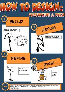
The idea is to brainstorm first and perfect later. This is a fun-filled, stress-free way to get creative and save time as well. It saves time because you don’t get bogged down in small details whilst you are envisioning the bigger picture. There is no course without a map. Have fun with the map. Your story creates the template, and from this you can create the look.
The bottom line is that you need context to bring your information to life and learners need to interact with this content to transform information into simulation. Cognitive, emotional and creative engagement with elearning content leads to confidence, learner autonomy and mastery.
Visual Design
Despite the richness of this multi-media world we live in, many professionals still deliver content in terms of text, text and more text. In fact, many professionals rarely think in terms of visual design, and even if they do, they quite often fail to realise the full significance of visual learning.
Define your look and refine your message.
Whatever presentation tools you choose to use for your courses, you can start off by choosing a colour scheme, background design, fonts and images for your slideshow or multi-media creation.
Then train yourself to visualise your points. Your slides should not be too heavy on text. If they were purely text-based, they would be documents or leaflets, not presentations. Images, photos, mindmaps, infographics, memes, smart art, doodles and sketch notes can tell your story for you in 5 seconds or less. You can learn these tools and tricks slowly but surely. If you are just starting out in presentation design, just experiment with images and Powerpoint/Prezi visualisation tools.
The Power of Attraction.
You can use some visual design tricks to attract attention to certain aspects of your core message. Playing with font sizes, contrast, perspective and animation makes a big difference to what the audience will take away from your presentation.
A key point to remember here when choosing colours, fonts and sizes is that your presentation has to develop character and style. Through the use of emphasis you draw attention to the essence of the lesson at hand. The feel and theme of your presentation can be emphasised through the effective use of fonts, just 1 to 3 per presentation, and the emotive use of colour. Visual impact depends on how font, colour, and perspective can achieve flow through wise use of contrast.
Here are some tips for creating narrative visual structures that go beyond factual representations of language.
1) Realise that imagery is integral to the learning process.
Practice translating the main points of your text into some kind of imagery – whether it’s comic dialogue, charts, smart art, use of icons, mindmaps or infographics.
We teach our students how to summarise detailed texts and paragraphs by extracting themes, main points and rewriting them in their own words. Visual literacy is just like this, but goes one step further. We isolate key nuggets of information from text or thoughts and then represent them via imagery, sound, music and diverse forms of multimedia.
2) Do not use multimedia mindlessly.
Just inserting sound, imagery or special effects can be meaningless and unnecessary if your use of media does not represent the heart of the lesson in question.
3) You can get the hang of visualising concepts by tuning into your own thought processes.
Do you always think in words or do you sometimes think in pictures? This kind of metacognition makes you more creative and more likely to make lateral connections beyond the linearity of typical slideshow presentations.
4) Play with context.
We often think of framing messages within a suitable context, and this is good. However, we can also be counter-intuitive and make something stand out from it’s context. If you blend and conform too much you’ll create a situation of the “bland leading the bland” as Nancy Duarte says in her book, “Resonate: present visual stories that transform audiences”
5) Make use of metaphor, symbolism, analogies, myths and movies.
You can also use story templates for any kind of presentation or course, such as The Hero’s Journey. Your lesson can have a beginning, middle and end, and a main character with a mission or problem to solve. All lessons are missions, all learning is problem solving.
Experiment with your blank canvas
When you realise the power of imagery and perspective in reaching out to learners, your teaching vision will take on a life of its own. Your images can relate to each other in meaningful ways. We can see this, for example, in the use of image & text in comics or visual representations of data on infographics. The empty space on your slides is just as important as the printed content, as space will determine how clearly a message impacts the learner. What should you include? What should you take away? Less is more. Try to strip away what you can so that your core message is relayed through the interplay of powerful images with text.
Refrain from deafening the audience.
Well, I don’t mean your speaking voice this time. I’m referring to noisy slides. If you haven’t grasped the less is more principle yet, here are some thoughts on minimalism. Cluttered slides are visually and cognitively noisy, stressful, mind-boggling and confusing. Therefore, elearning design is often about making tough decisions. How can you love your white space and fill it with just the perfect minimalist image and text combination? Focus on your teaching aims and instinct. A few sound design principles, such as those mentioned above, blended with your core message will help you to highlight the essence of your lesson.
Think like a journalist.
Think of slides as headlines with magazine-style clout . Do you really need 100 words to explain something that a headline could announce? If you find that you have to include lots of extra text for academic courses, you can just hyperlink to documents that students can study before or after the live online presentation.
Embed videos, comics, animations, blogs etc.
Your slides are not just linear transitions. Any Powerpoint presentation can be laterally designed via hyperlinks and multi-media. Prezi is even more powerful as a multi-media presentation tool that does away with slides completely. You can even blend Powerpoint with Prezi for the best of both worlds.
Be yourself, be sticky, be social.
Find and define your own voice and allow your presentations to take on your personality. Don’t try to be academically voiceless, neutral or encyclopedic. As you share the essence of yourself through your work, you appeal to emotions, social contagion, and the viral effect of authenticity. This is what really attracts and keeps students/clients and it is the foundation stone of your business integrity.
Presentation Tools
Prezi as a presentation tool provides visual storylines that you can edit and customise. As a tool it’s designed for lateral-thinking and trains you to think outside the box. Simple drag and drop features allow you to play with size and perspective , embed video, zoom, pan, show the bird’s eye view and then focus on the core message. One of the best ways to experiment with the ideas and principles described above would be to take the time to play with Prezi.
Let the students take over.
Finally, How can our students continue to shape the course we have already shaped?
By following the design principles above and including open-ended activities that link to multi-media, social networking or web quest challenges , we can get student to create more content as part of their learning journeys . Some ideas include blogging, creating their own You Tube channels, producing ebooklets, comics, podcasts, infographics and their own presentations that reflect and build upon their own learning experiences and challenges.
Have fun with your vision, your art and your teaching. Most of all, measure your success through student creativity.
[jbox title=”Related Articles”]
Find and define your teaching voice online
How can we design great learning experiences?
How do we create compelling design that supports learners?
Thoughts on visual design
The importance of imagery in ebook design
[/jbox]